
When a web service misbehaves, we have options. We can SSH into a box, attach a debugger, tail a log, roll back a deploy. When a spacecraft misbehaves, operators have exactly one window into what is happening: the telemetry it sends home.
That constraint has shaped how mission operations teams think about monitoring for decades, and I think most backend teams would benefit from borrowing their habits. Not the hardware or the protocols, but the discipline: every value has a definition, every definition has limits, and every limit has a planned response.
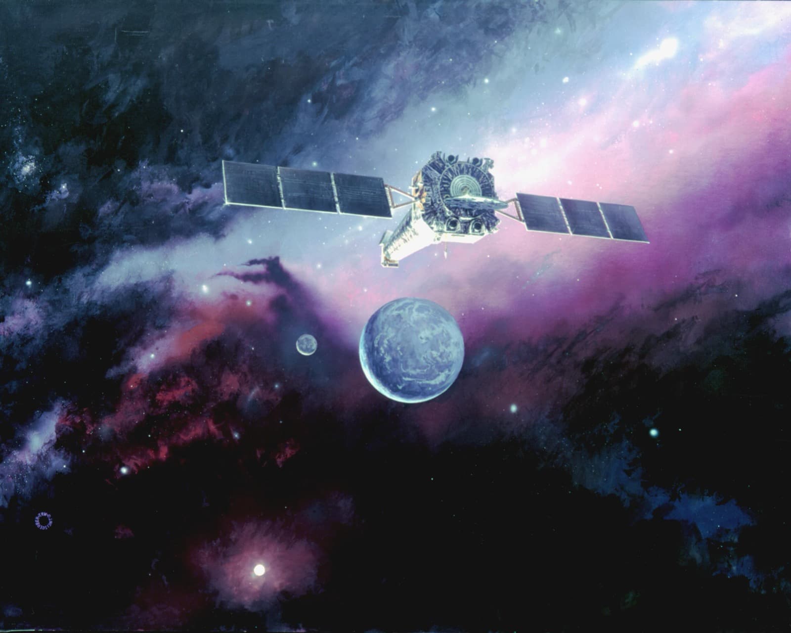
Chandra X-ray Observatory, artist's concept. Credit: NASA/CXC.
Telemetry is the only witness
Spacecraft send a steady stream of "housekeeping" telemetry: voltages, temperatures, currents, mode flags, counters. Operators don't get to ask follow-up questions in real time; if a value isn't in the stream, it effectively doesn't exist.
Backend teams rarely feel this pressure, because we can usually go and look. But the moment you're debugging a production incident at 3am, from a dashboard, without shell access to the box that's on fire, you're in the same position as a flight controller. The question becomes the same: did we decide in advance what we'd need to know?
Limits are decisions, not decorations
The most transferable idea from mission operations is the two-level limit. The team behind the ACIS instrument on the Chandra X-ray Observatory described setting two limit levels per telemetry value: a red violation triggers an immediate response, while a yellow one allows further analysis before anyone acts. NASA's PACE telemetry monitor uses the same green, yellow and red scheme, with yellow meaning a value is approaching its limits but still within operating levels.
What I like about this is that the colours aren't aesthetic. Each one encodes a decision the team made ahead of time:
- Green: nothing to do.
- Yellow: someone should look, during working hours, with time to think.
- Red: respond now, following a known procedure.
PACE's help page is explicit about the human side too: a red parameter is a violation that is under investigation by the team. Red isn't just a colour on a screen; it means someone owns it right now.
Compare that with a typical backend alert: a single threshold, set once, paging someone at any hour, with no written answer to "and then what?". The Chandra team also derived their limits from roughly 300 days of flight data rather than guessing, which is a habit worth stealing: base thresholds on observed behaviour, not on round numbers.
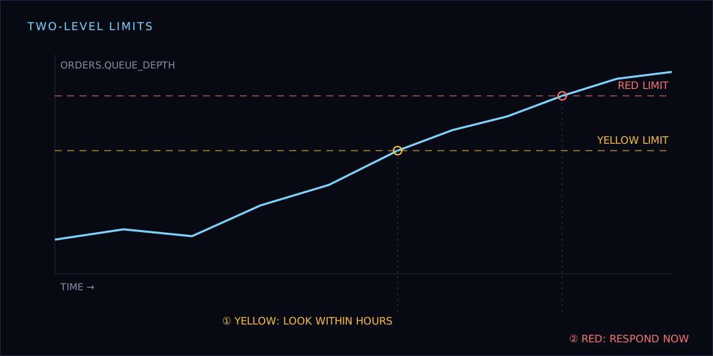
Here's how I'd model it in TypeScript:
type LimitLevel = 'green' | 'yellow' | 'red';

interface Limits {
  yellow: { low?: number; high?: number };
  red: { low?: number; high?: number };
}

function evaluate(value: number, limits: Limits): LimitLevel {
  const outside = (band: { low?: number; high?: number }) =>
    (band.low !== undefined && value < band.low) ||
    (band.high !== undefined && value > band.high);

  if (outside(limits.red)) return 'red';
  if (outside(limits.yellow)) return 'yellow';
  return 'green';
}
The interesting part isn't the code; it's that Limits lives next to the metric definition and gets reviewed like any other change.
A dictionary for every value
Spacecraft telemetry isn't a pile of anonymous numbers. Each parameter has a definition: its name, type, units, how it's encoded, and how to calibrate it. The space industry even standardised a way to exchange those definitions between organisations: XTCE, the XML Telemetric and Command Exchange format, an OMG standard adopted by CCSDS, exists so that teams can move a mission's telemetry and command definitions between systems without re-implementing them.
Most backend metrics have no such home. A gauge called queue_depth appears in code, someone builds a dashboard on it, and six months later nobody remembers whether it counts messages or batches, or what a "bad" value looks like.
A lightweight metric dictionary fixes most of that:
interface MetricDefinition {
  name: string;
  description: string;
  unit: 'ms' | 'count' | 'percent' | 'bytes';
  owner: string;
  limits: Limits;
  runbook: string; // what to do on yellow and red
}

export const metrics: MetricDefinition[] = [
  {
    name: 'orders.queue_depth',
    description: 'Messages waiting to be processed by the order worker',
    unit: 'count',
    owner: 'checkout-team',
    limits: { yellow: { high: 500 }, red: { high: 5000 } },
    runbook: 'docs/runbooks/order-queue.md',
  },
];
Once this exists, you can generate dashboards, alerts and documentation from one source, and a pull request that adds a metric without limits or a runbook becomes easy to reject.
The dictionary doesn't need to be fancy. A typed file in the repo, validated in CI, gets you most of the benefit.
Raw values are not the answer
A detail that's easy to miss: much of what a spacecraft sends isn't in human units at all. A temperature sensor reports a raw count from an analog-to-digital converter, and somebody has to turn that number into degrees.
Telemetry definitions handle this explicitly. XTCE models it with calibrators: the YAMCS documentation for its XTCE polynomial calibrator describes it as a curve from raw to calibrated values, defined by a set of polynomial coefficients, and the open-source space-packet-parser library lists spline, polynomial, math-operation and context calibrators among the kinds it supports. Context calibrators are a nice touch: the same raw value can mean different things depending on the state of the system.
The important design choice is where that conversion lives. It lives in the definition, once, not scattered across every dashboard and script that reads the value.
Backends get this wrong constantly. One service logs durations in microseconds, another in milliseconds, a dashboard divides by 1,000 to "fix" it, and an alert threshold is set against the wrong unit. The fix is the same as on a spacecraft: store raw values, and keep the conversion next to the definition.
interface Calibration {
  unit: 'ms' | 'celsius' | 'percent';
  toEngineering: (raw: number) => number;
}

const calibrations: Record<string, Calibration> = {
  'worker.batch_duration': { unit: 'ms', toEngineering: (us) => us / 1000 },
  'disk.used': { unit: 'percent', toEngineering: (ratio) => ratio * 100 },
};
Limits are then written in engineering units, against the calibrated value, so a reviewer reading red: { high: 2000 } knows it means two seconds and not two milliseconds.
Stale data is its own state
One detail from Chandra's monitoring display stuck with me. Alongside yellow and red, its Snapshot page uses a separate colour for stale data: values that haven't been updated recently.
This matters more than it sounds. A metric that silently stops reporting looks exactly like a healthy flat line. Plenty of incidents start with a dashboard that was green only because nothing was arriving.
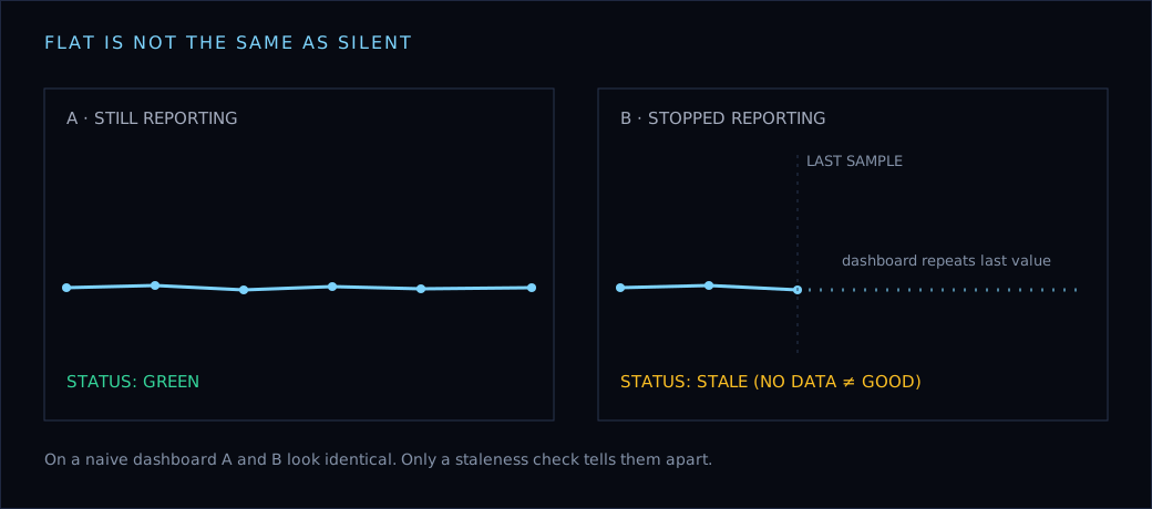
Treating staleness as a first-class state is cheap:
type Status = LimitLevel | 'stale';

function status(sample: { value: number; at: Date }, limits: Limits, maxAgeMs: number): Status {
  if (Date.now() - sample.at.getTime() > maxAgeMs) return 'stale';
  return evaluate(sample.value, limits);
}
If you take one thing from this post, make it this: "no data" should never render as "good".
Derived values carry the meaning
Raw telemetry often isn't what operators actually care about. A single temperature might be fine, but the difference between two sensors, or a rate of change, tells you something is drifting. Operations teams routinely compute values like these on the ground and put limits on them too.
Backends have the same opportunity. Error counts are noisy; error rate per request is meaningful. Latency averages hide problems; the gap between p50 and p99 reveals them. Queue depth matters less than whether it's growing faster than workers drain it.
Every red needs a procedure
Flight operations teams don't improvise when a red limit trips. They follow procedures written in advance, because the moment of failure is the worst moment to be inventing a response.
The backend equivalent is a runbook linked from every red alert. Not a wiki page that says "investigate", but the first three things to check and the first safe action to take. If you can't write that down for an alert, that's a strong hint the alert shouldn't page anyone yet.
What I'd borrow tomorrow
If I were starting fresh on a backend's observability, I'd steal these habits from mission operations:
- Define every metric in one typed dictionary, with units, calibration and an owner.
- Give every metric two limits, yellow and red, based on observed data.
- Decide in advance what each level means and who responds.
- Treat stale data as its own state, never as healthy.
- Put limits on derived values, not just raw ones.
- Link every red alert to a runbook with a first safe action.
None of this needs a spacecraft. It just needs the mindset that telemetry is your only witness, so you'd better have decided what it should be able to tell you.
💡Key Takeaways
- 1Mission operations treat telemetry as the only window into the system, so every value is defined and bounded in advance
- 2Two-level limits (yellow and red) encode decisions about who responds and how fast
- 3A typed metric dictionary with units, owners, limits and runbooks keeps dashboards and alerts honest
- 4Stale data must be its own state, because a silent metric looks exactly like a healthy one
- 5Derived values such as rates and differences often carry more meaning than raw readings
- 6Every red alert should link to a written procedure with a first safe action